
Magic Leap
Creating a family of design systems for a pioneering AR headset and its ecosystem
Contribution
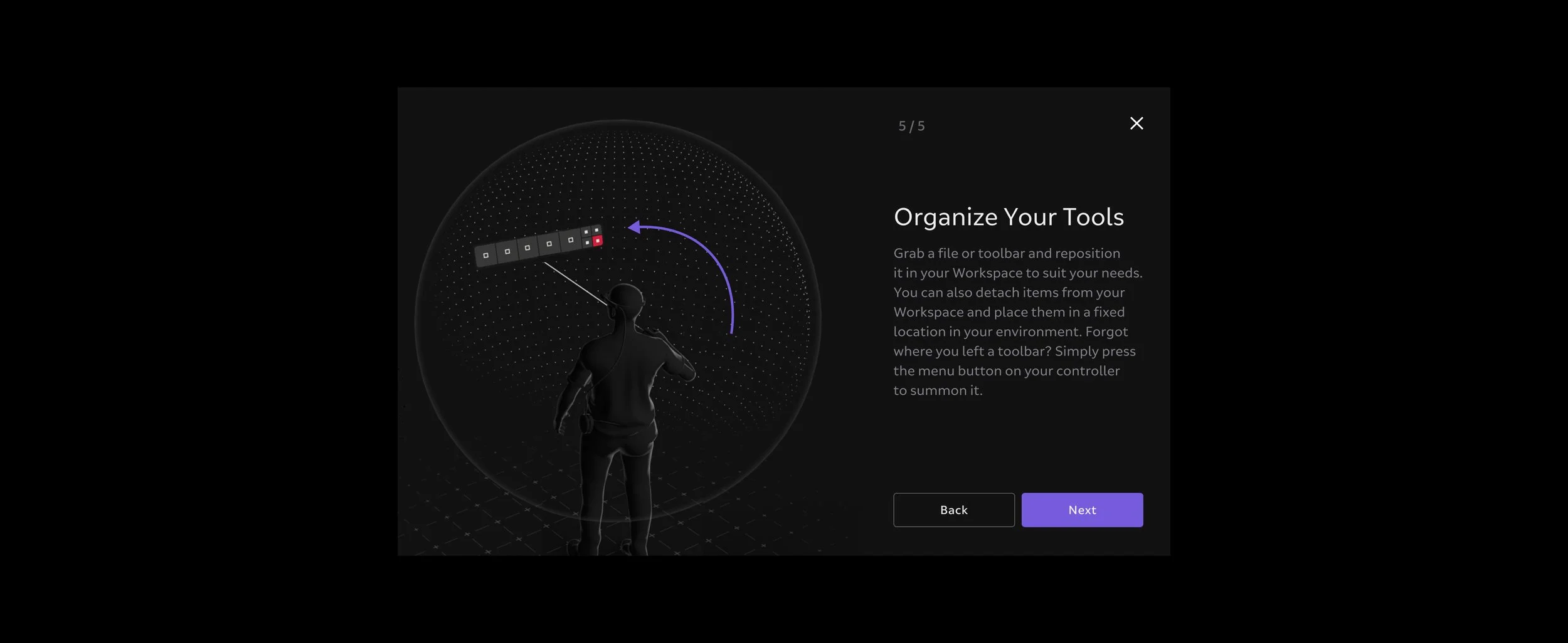
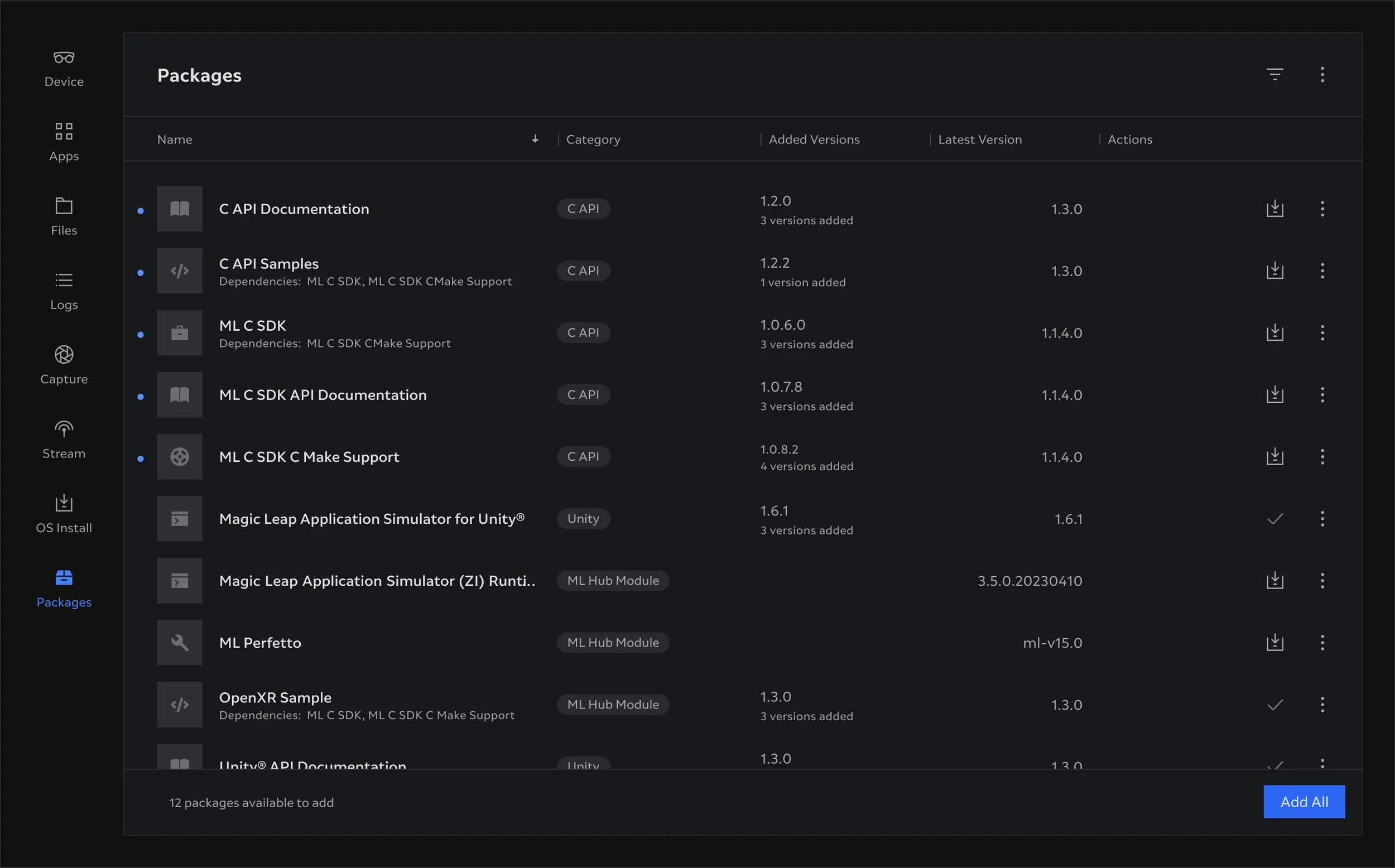
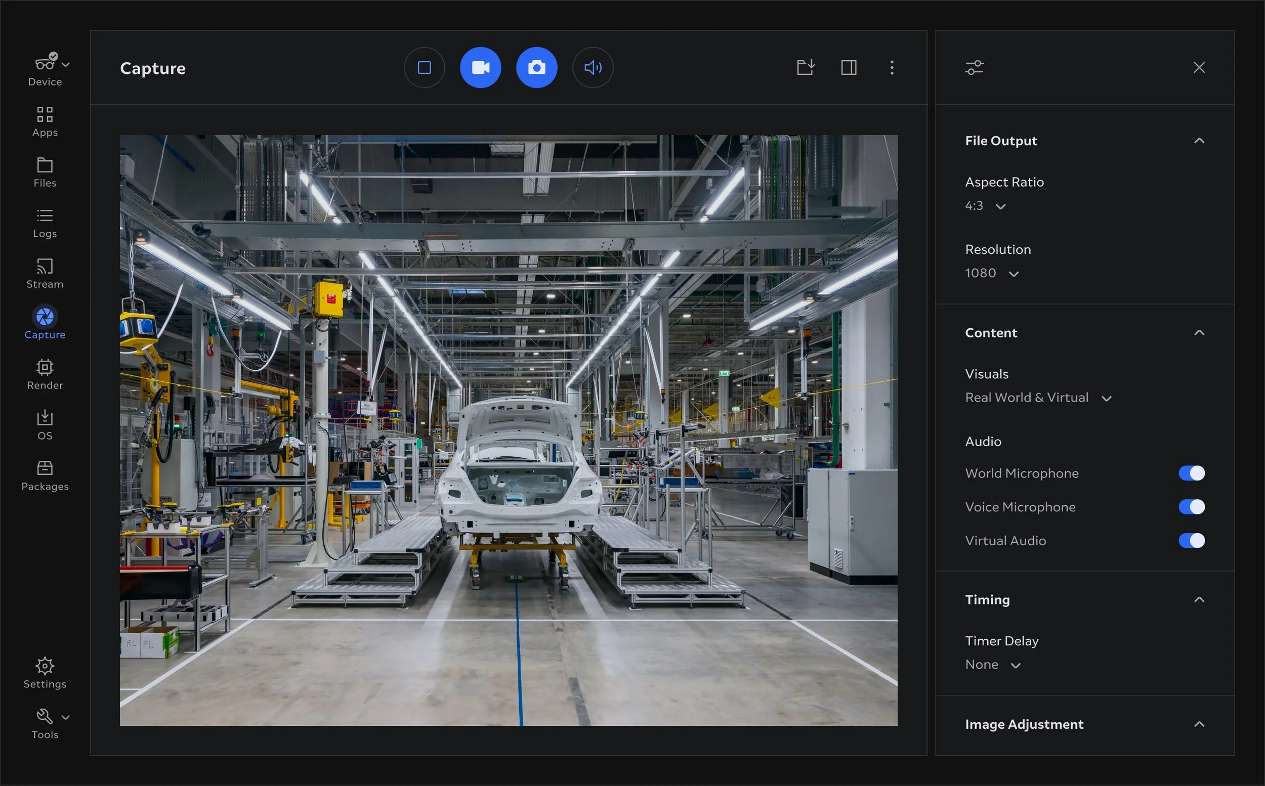
As part of the Platform team my work contributed to Home menu, Capture, Device Setup, Virtual Keyboard, System Settings, File Manager, AR Cloud and the The Hub projects of the Magic Leap 2 platform.
Overview
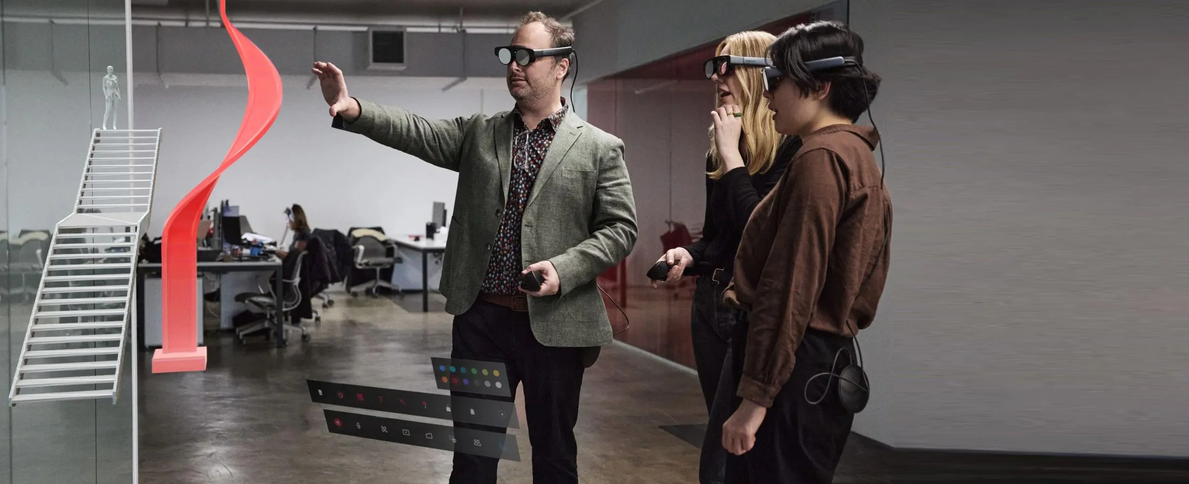
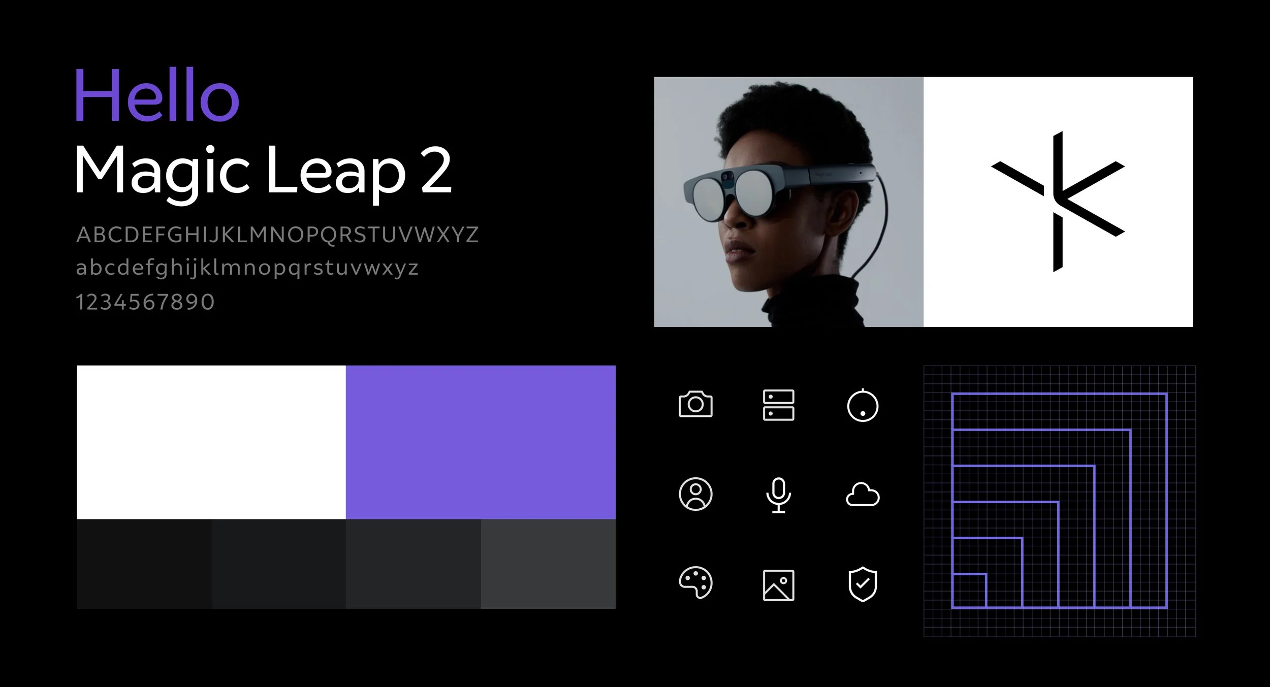
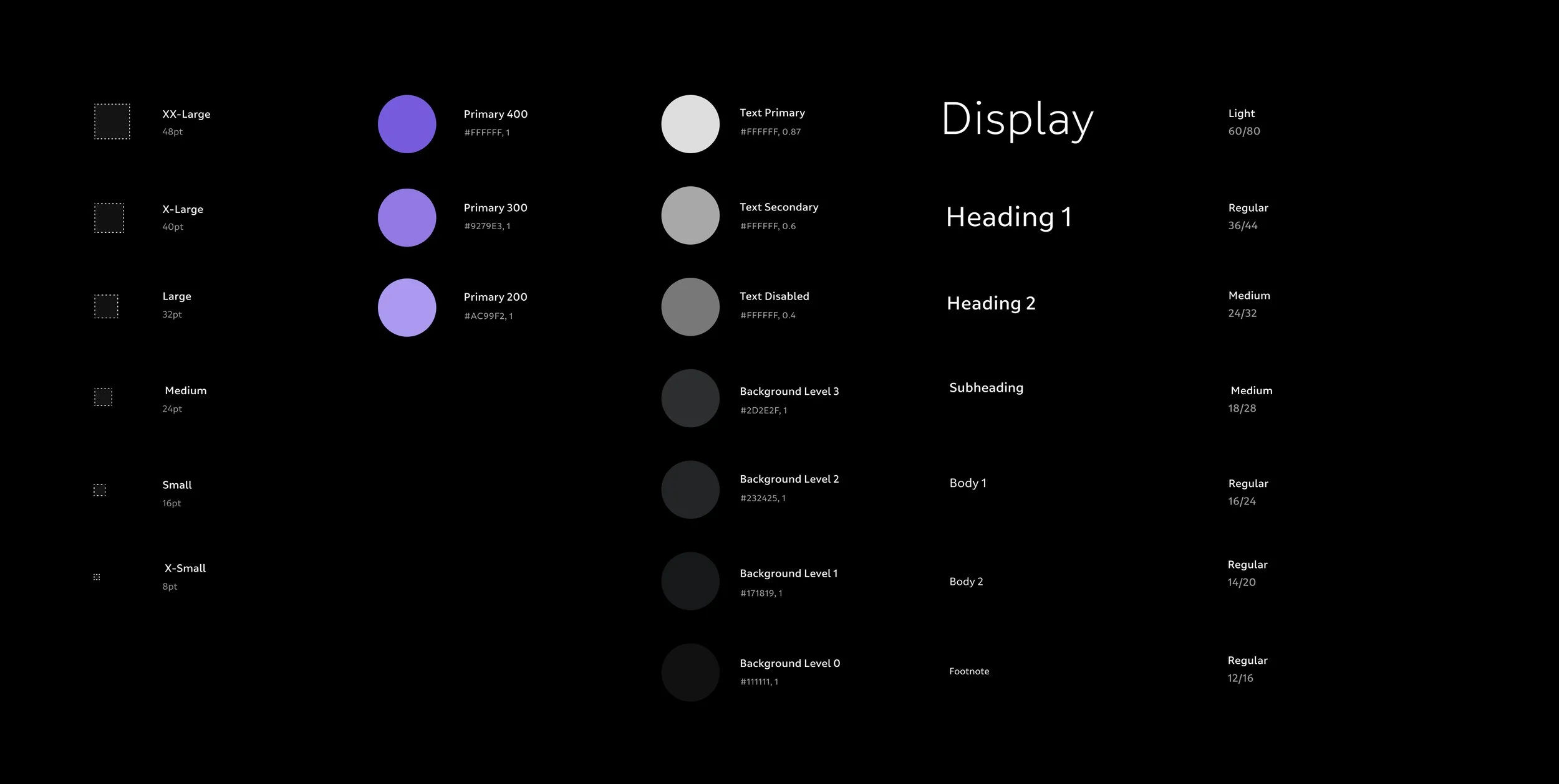
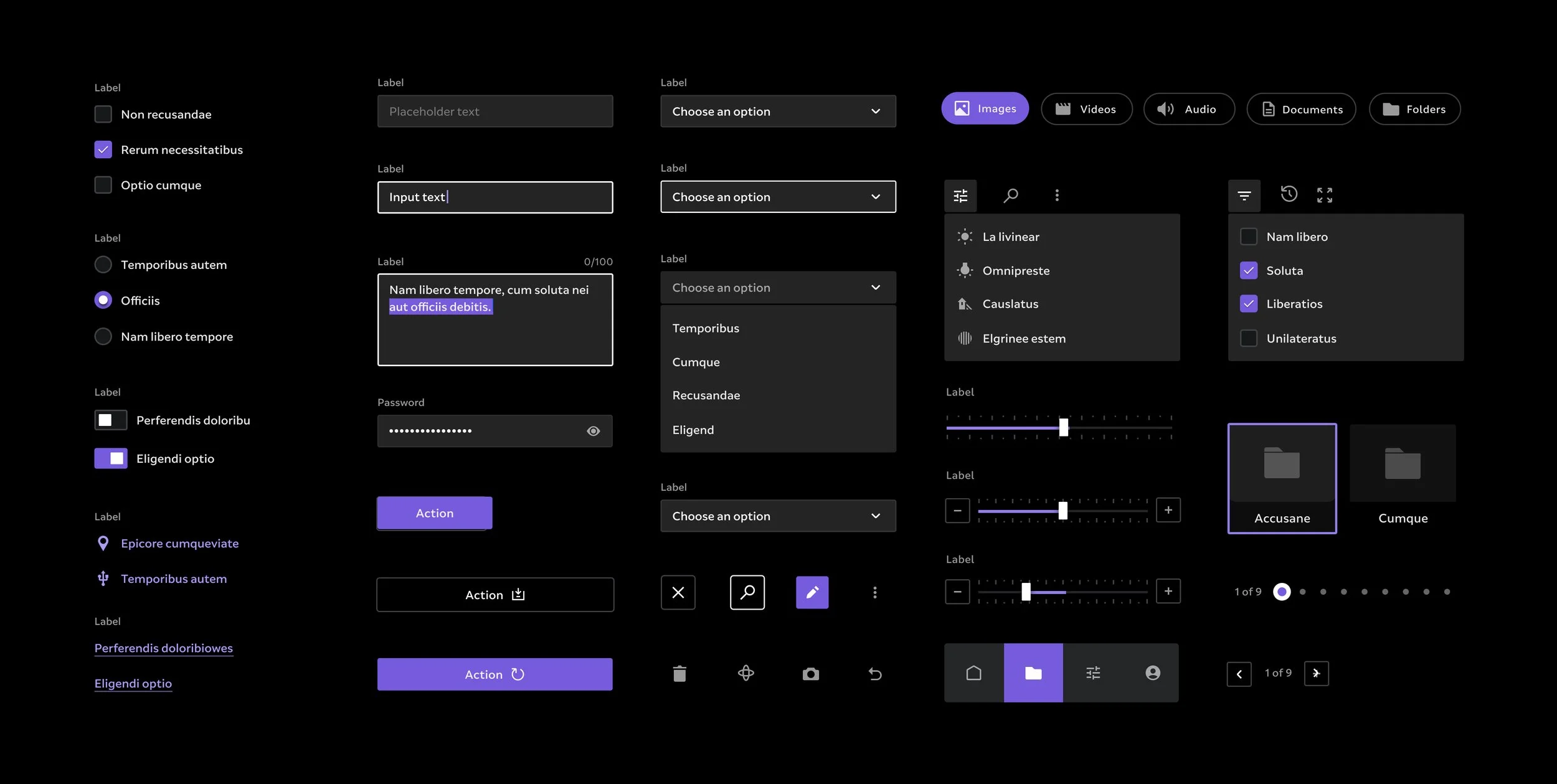
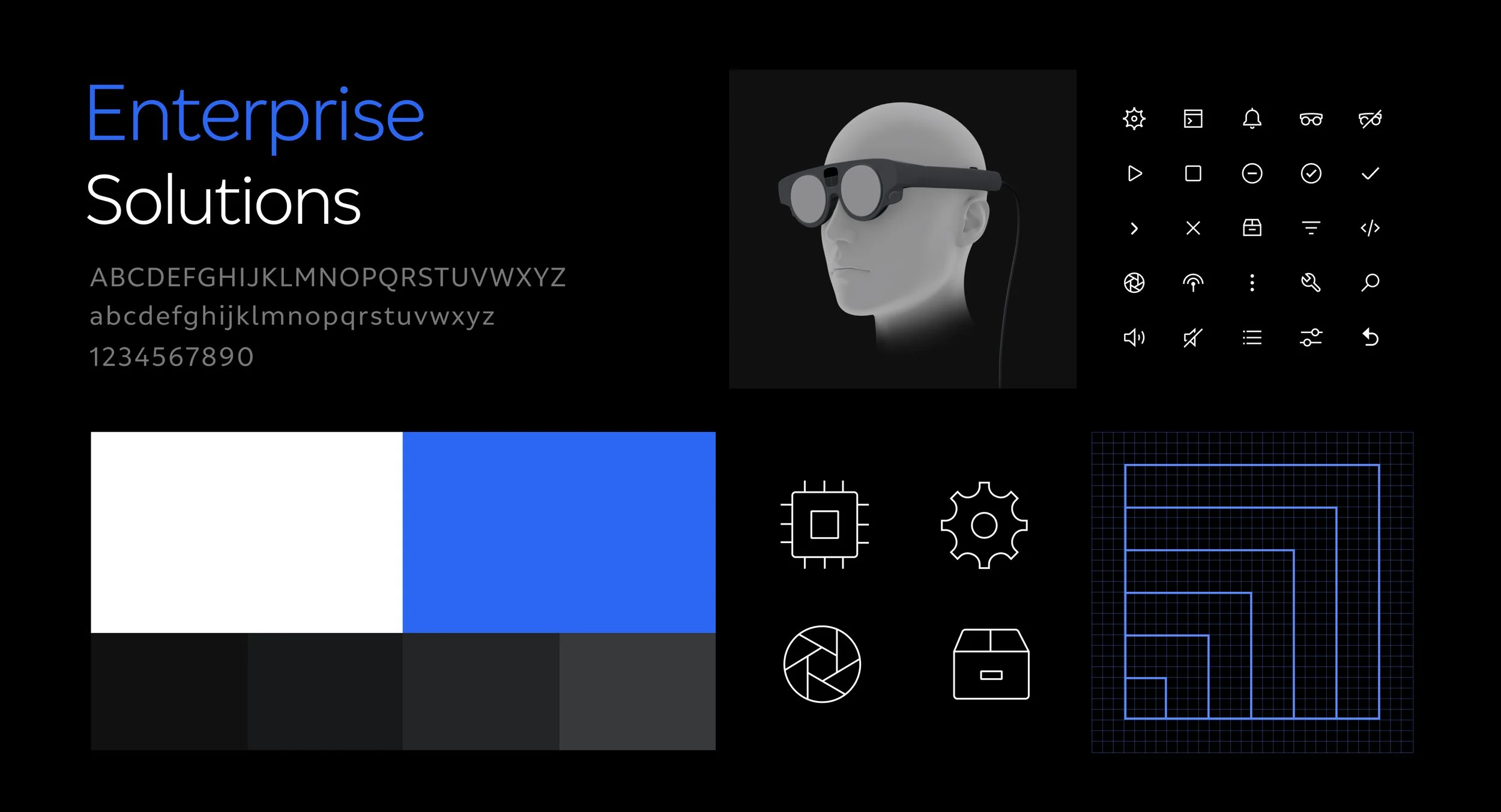
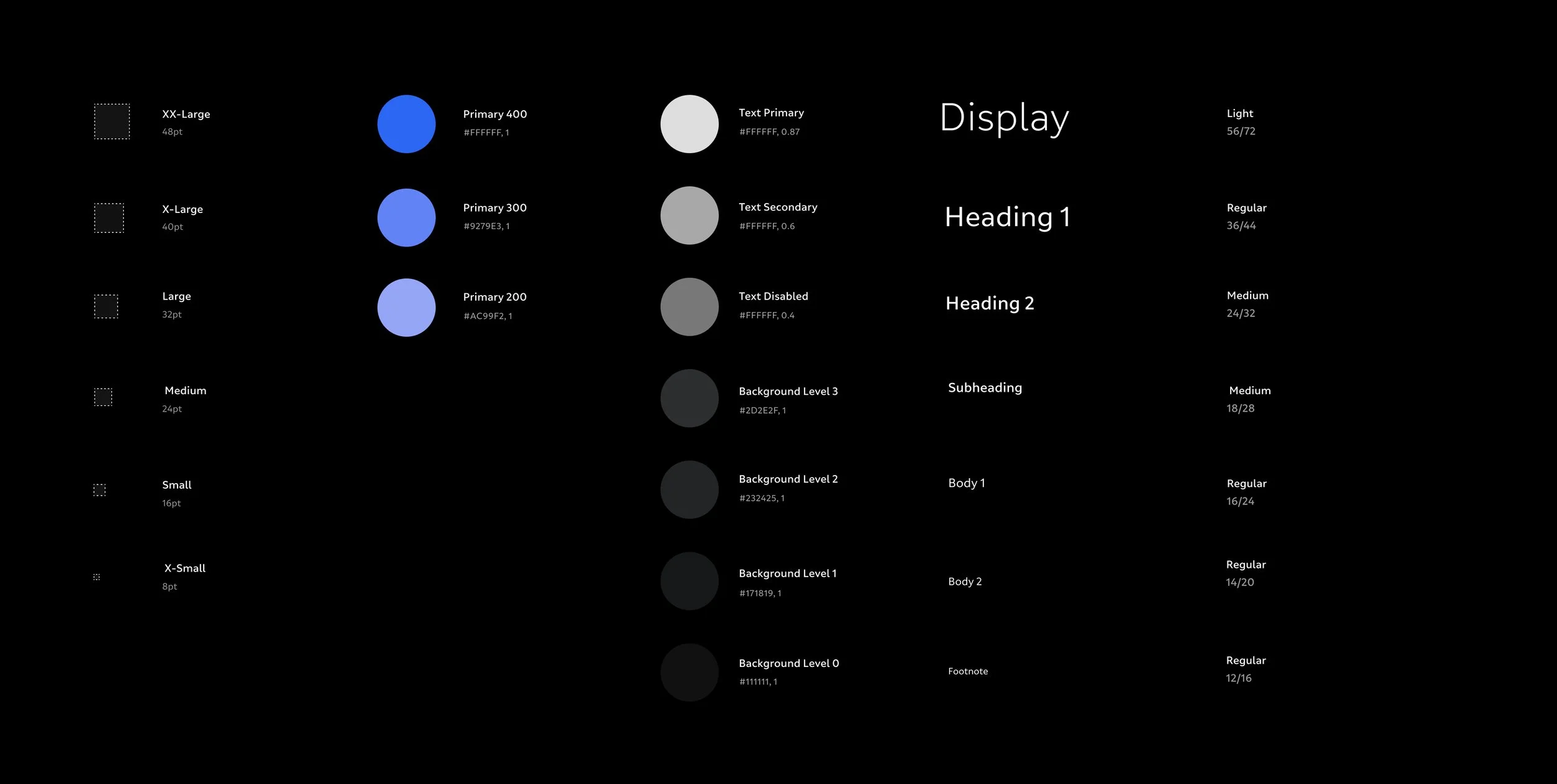
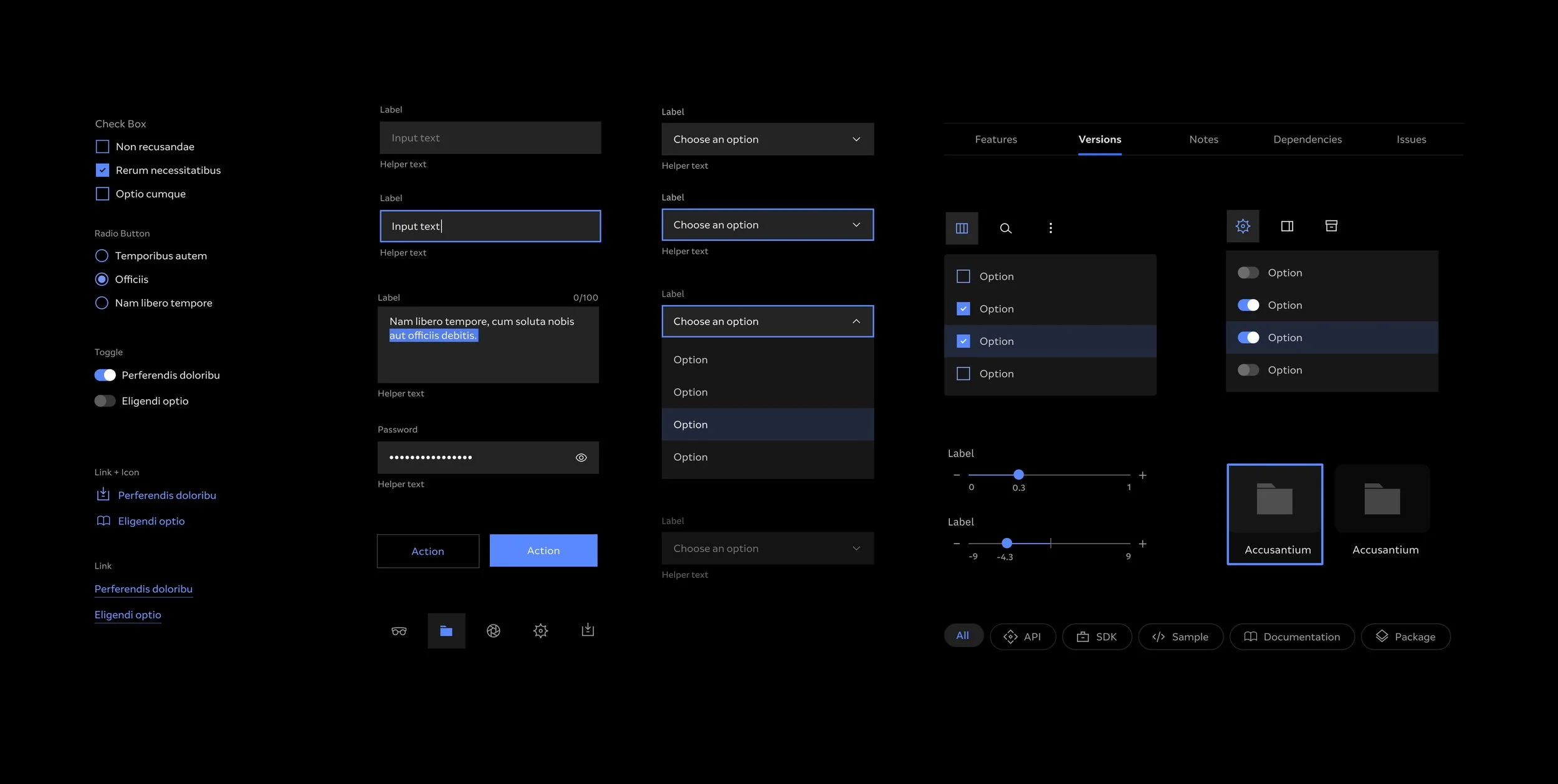
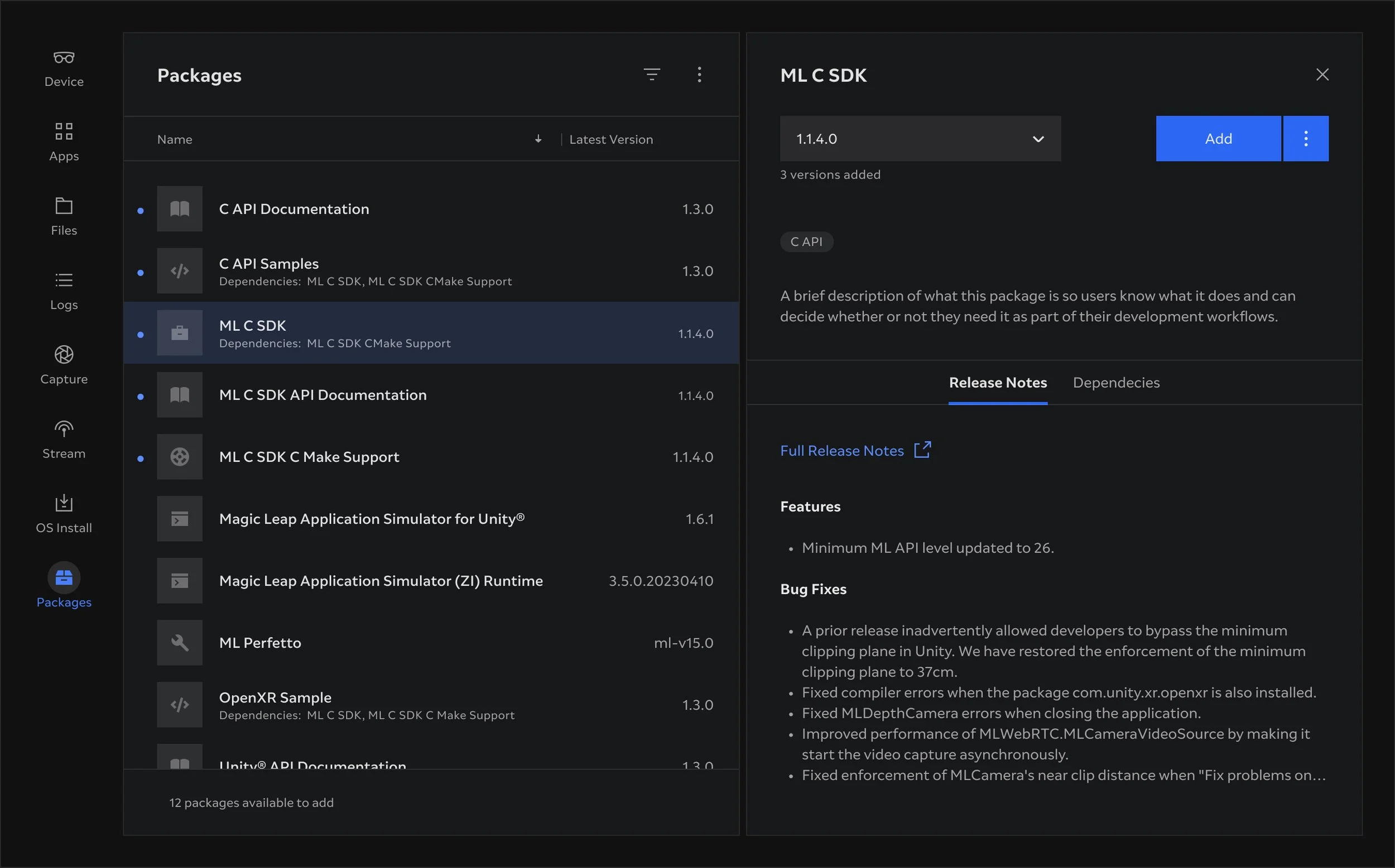
At Magic Leap I helped to create, maintain and evolve a family of design systems that spanned the AR operating system, bundled apps, cloud service web interfaces and desktop based apps.
I was involved at all stages of the design system project, from conception, visual design and component creation to library publishing and distribution.
As part of the project I was also contributed to definition of guidelines and rationale for applying and evolving the system, distribution of the guidelines in usable and efficient documentation for both designers and developers to reference.
Responsibilities
— End-to-end ownership of design system projects
— Extend brand expressions and styles for optimal user experience
— Craft reusable system modules
— Compile and maintain libraries of styles, components and patterns
— Prototype component interactions
— Define system guidelines
— Create and deliver system documentation
— Share knowledge and educate designers and developers
— Contribute to product design and strategic decisions
— Collaborate with product manages, researchers, designers and developers
— Collaborate with brand team
— Present solutions to stakeholders
Magic Leap
Spatial OS and system apps

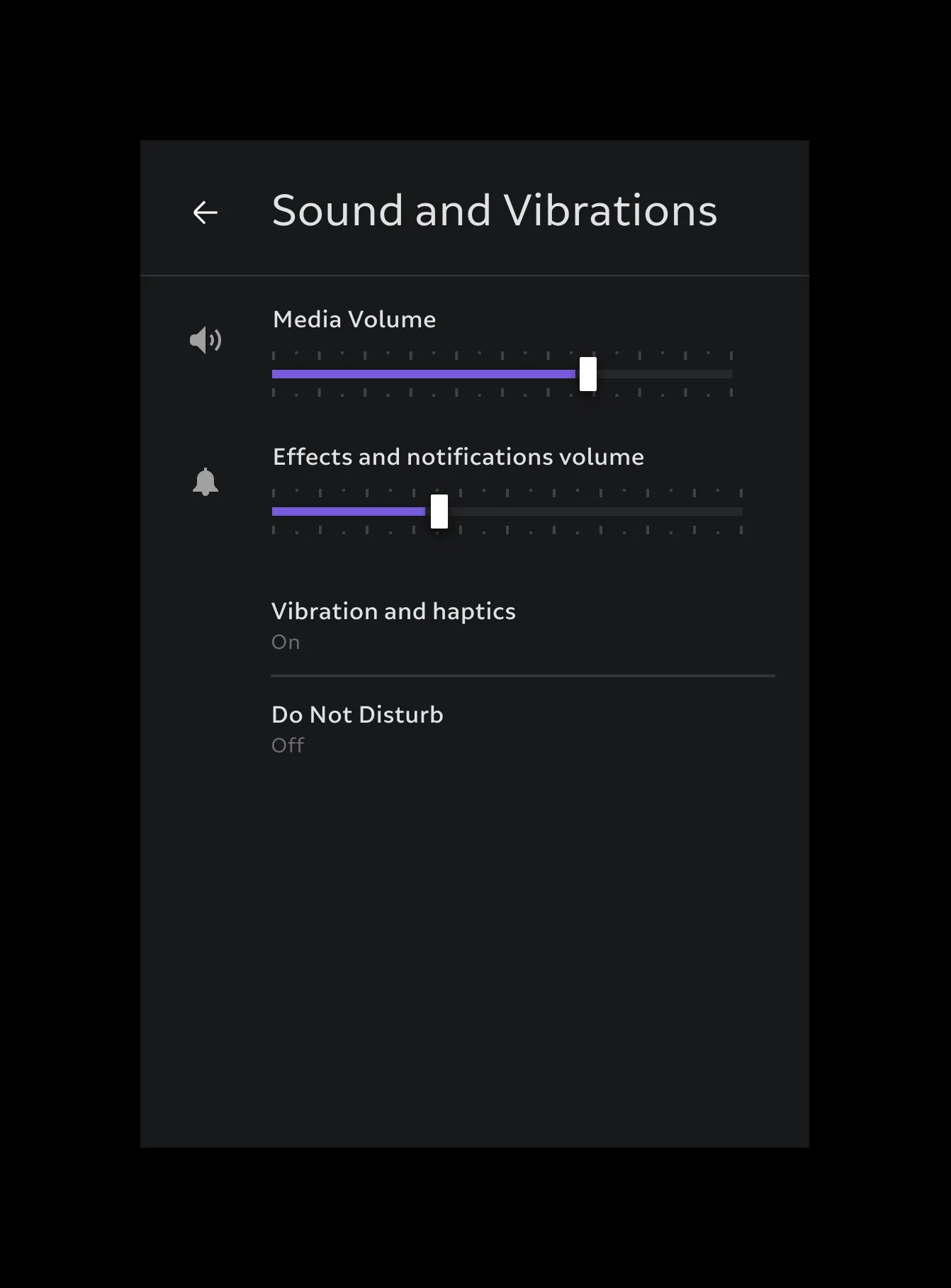
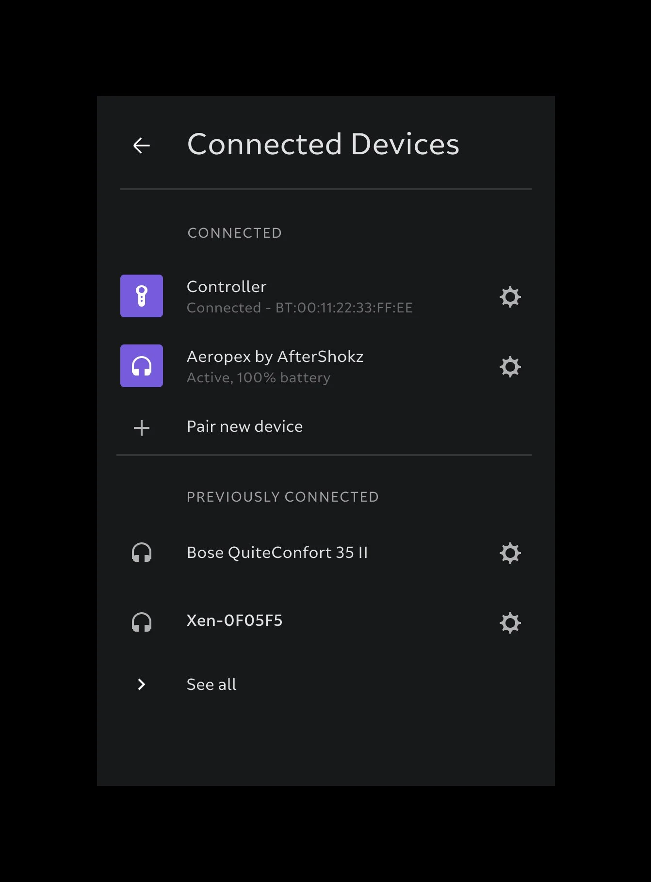
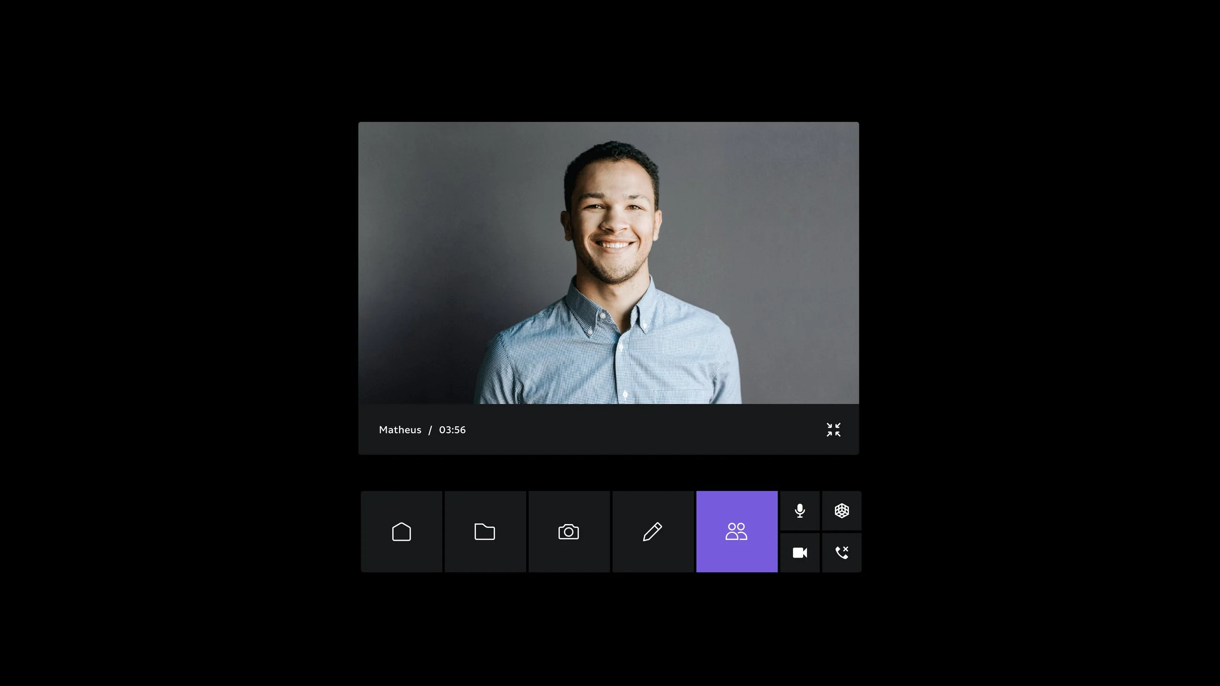
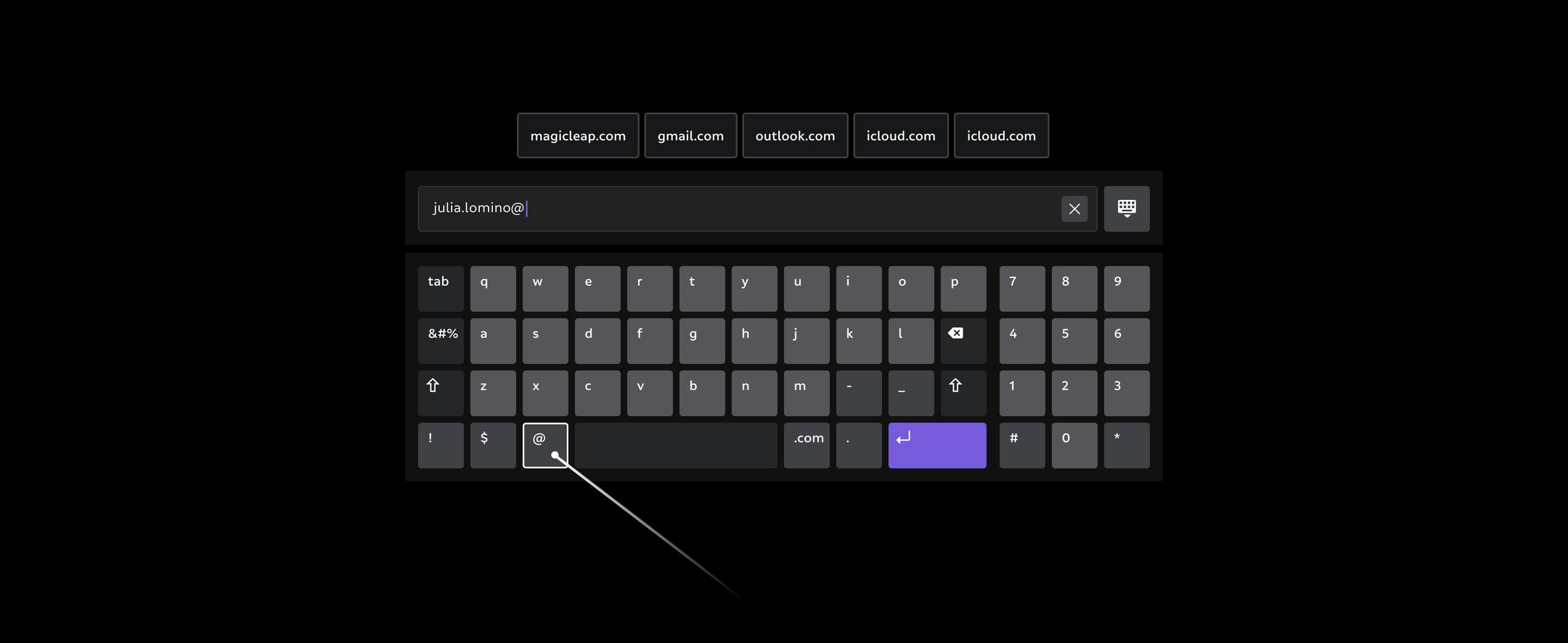
Magic Leap
Dev and admin tools

VISA Europe
Building a pattern library for new digital product development
My Contribution
Visual design of product interfaces, design system architecture and library infrastructure, definition and delivery of system documentation.
Overview
While working at Monetise design agency I was privileged to work on Visa Road Map and New Product Team. Visa partnered with Monetise to make use of their technologies and talent to boost efforts in fast moving mobile payments landscape.
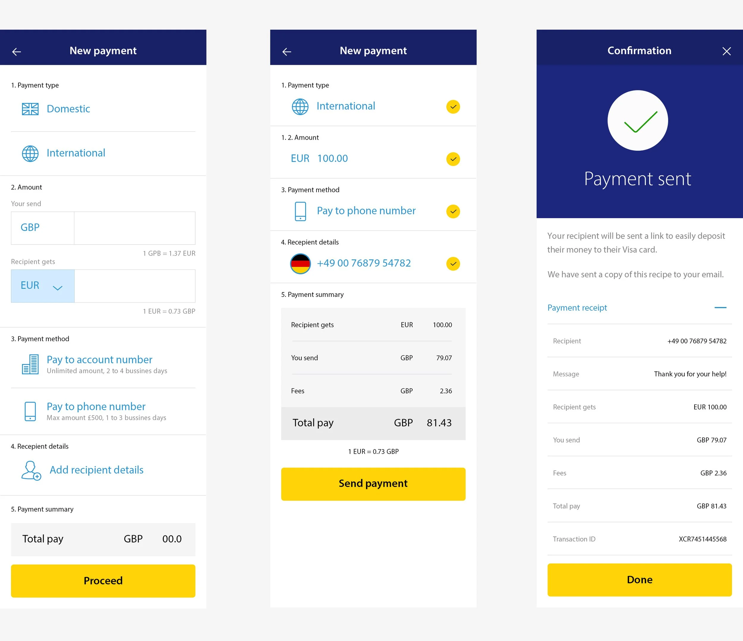
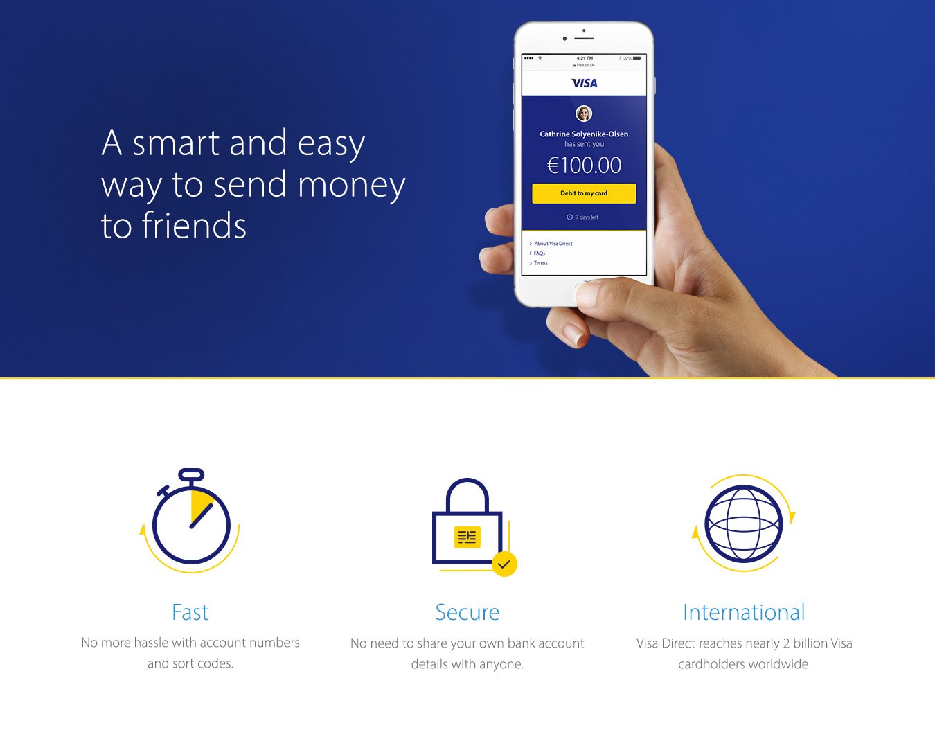
Together with my colleagues we were asked to explore new uses of emerging technologies and posible new directions for Visa digital products and services. The focus was on how to enhance convenience, simplicity and security in personal mobile payments.
The team worked in small groups on prototypes and concept products. Promising product candidates were tested and demoed to Visa's costumers, executives and partners. My primary responsibility was to support multiple product teams with reusable interaction patterns and a visual assets across the whole product portfolio.
Responsibilities
— End-to-end ownership of design system project
— Ownership of visual design for digital products
— Craft effective components, styles and assets
— Design and maintain online library of assets
— Define system guidelines
— Design and deliver system documentation
— Contribute to product and interaction design
— Present solutions to stakeholders
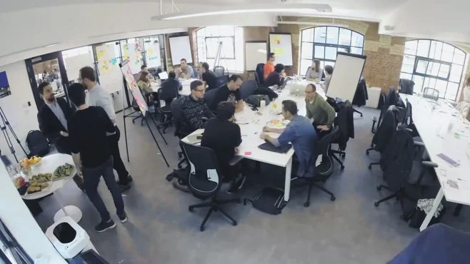
The Visa Digital Roadmap team workshop
The Challenge
A separate groups of designer working independently inevetably diverge in their design execution. But even at a very early stage of product design, it is important to work with consistency in interaction and look and feel. Product demos could be presented to different groups inside and outside of the company along side each other.
No one enjoys making last minute changes before presentation to C level executive to make the demo more on brand or to make it look like the other one presented in same session on the same device. To solve this problem the team was tasked with creating common patterns library for the use in demo and concept products.
I was part of a small team of 3, visual designer, UX designer and full stack developer. I focused and work on all visual design aspects of the pattern language. We were part of larger Visa design team frequently exchanging comments and insights.
Solution
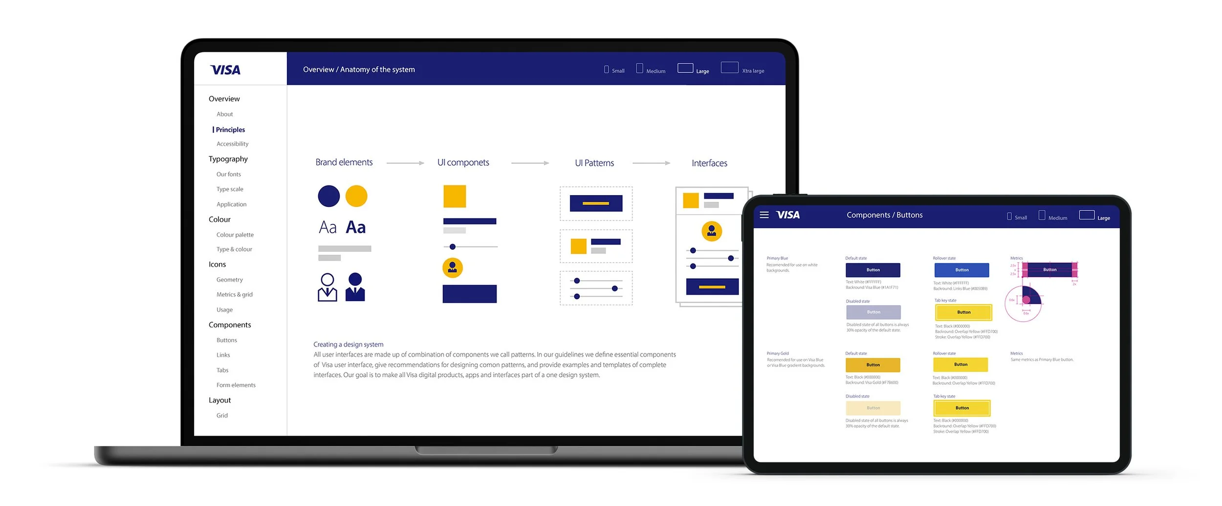
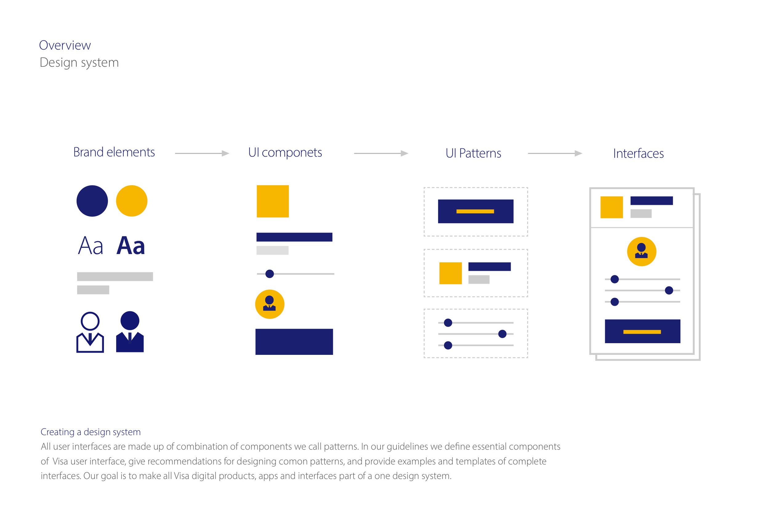
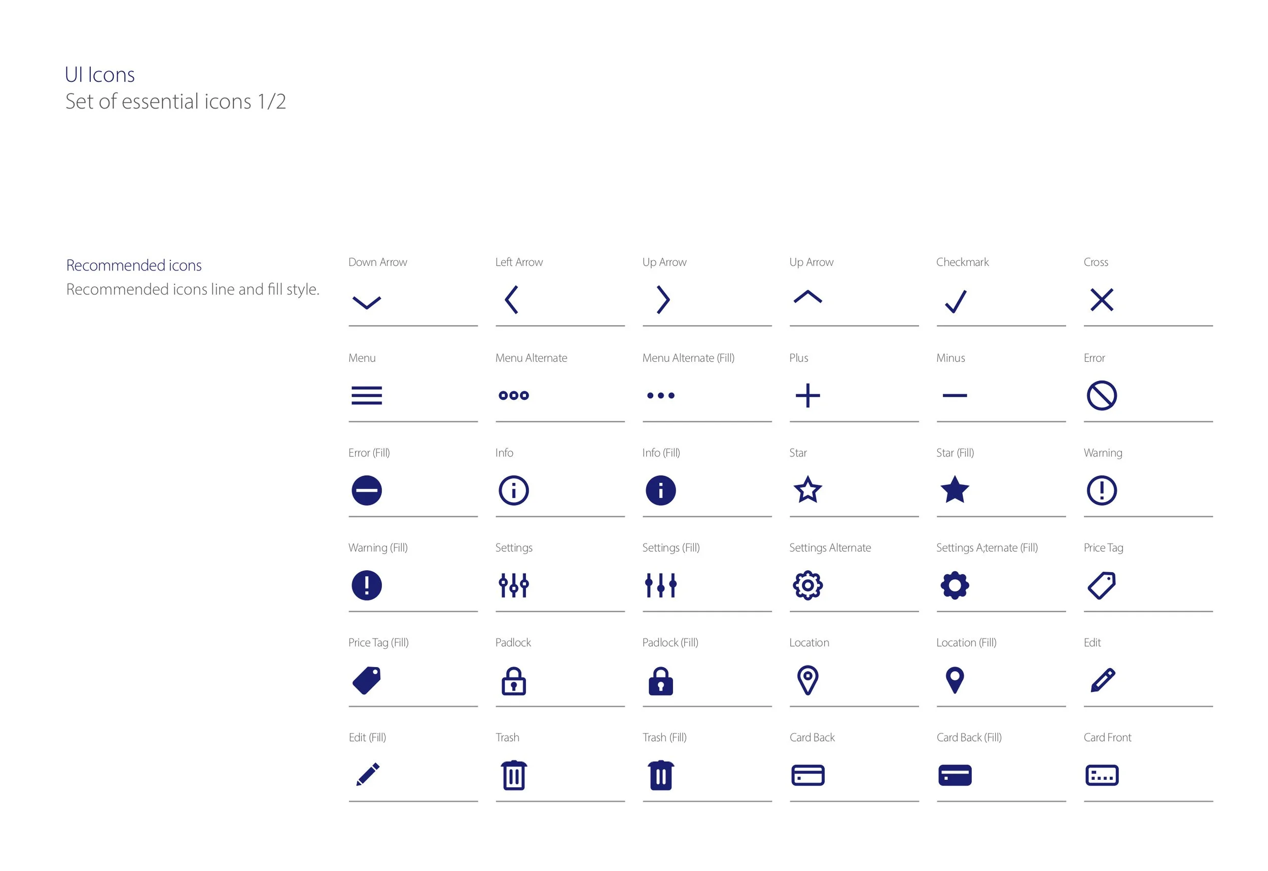
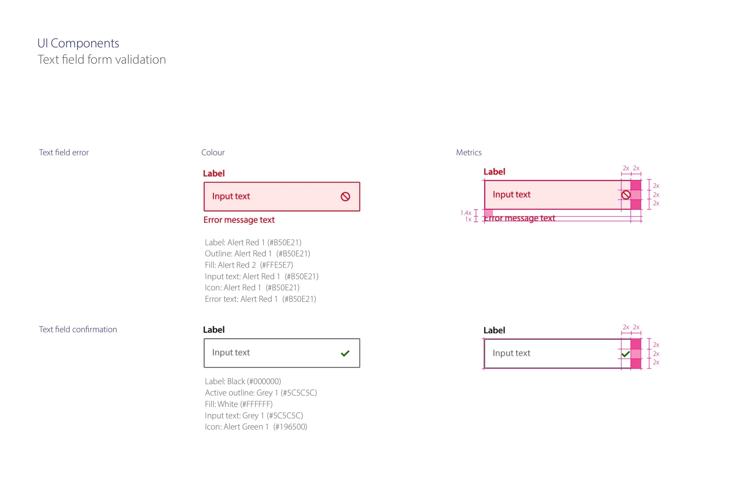
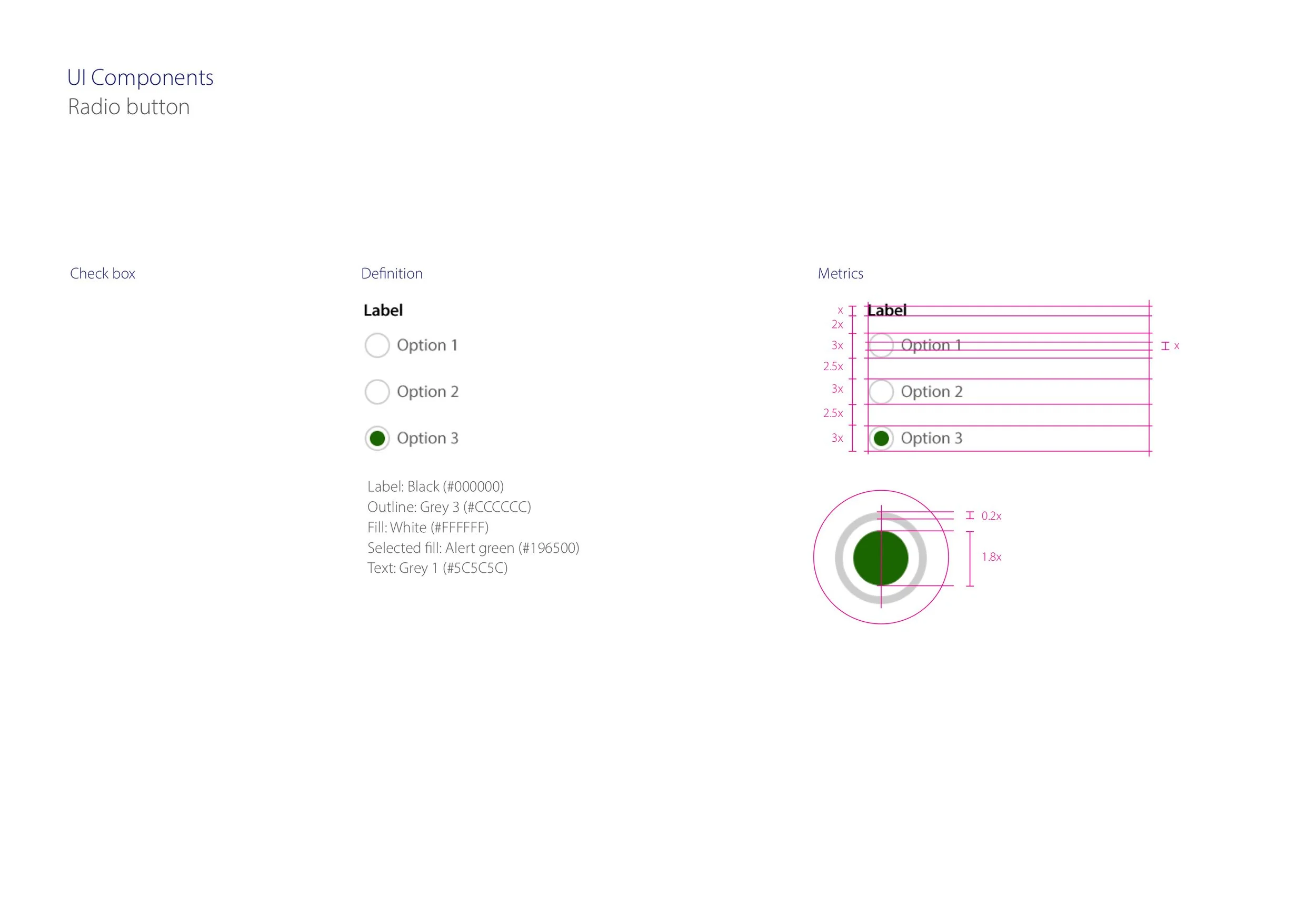
We used the popular atomic design approach to standardise essential set of common UI elements across mobile, tablet and desktop viewports. Specification of brand elements such as typography, colours, icons were complemented with detail definition of interactive UI elements such as button, input fields tabs.
Our process began with an inventory of existing designs. Reviewing and mapping individual screens we looked for recurring patterns and styles. Next we went on to fill any gaps to make sure we compiled a complete set of components that can cover typical user tasks in payments, card management and money transfers.
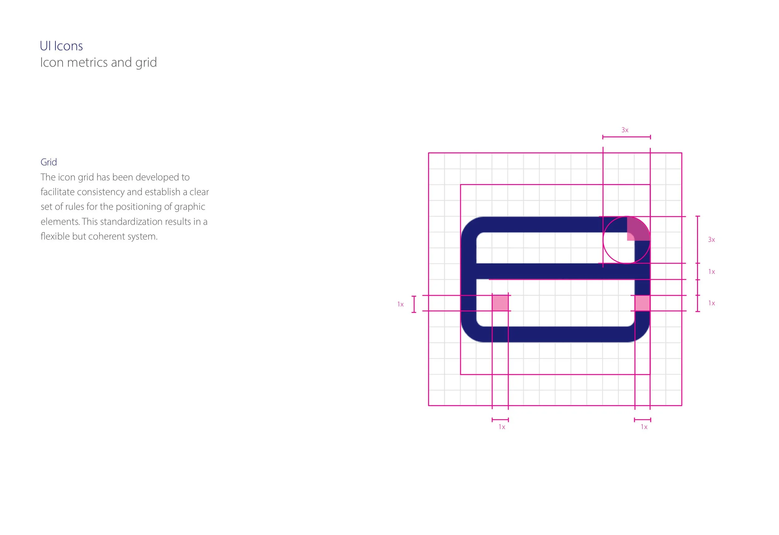
We moved on to unify the designs with rational approach to sizing and positioning. All element were crafted to highest usability standards with all interactive states covered and documented. The guidelines also included specification and advice for designing for maximum accessibility.
Results
We delivered pattern library in responsive website format. It included not only design documentation and guidelines but also chunks of code to copy for use by developers. The project helped the Visa team to establish solid ground for knowledge sharing and future library expansion.
Credits
Company — Monetise
Client — Visa Europe
Monetise Design Director — George Mayou
Visa Design Director — Teemu Mattilla
Product Designer — Sandro Brito

O₂ UK Mobile
Unifying user experience across web and mobile platforms with modular design
Context
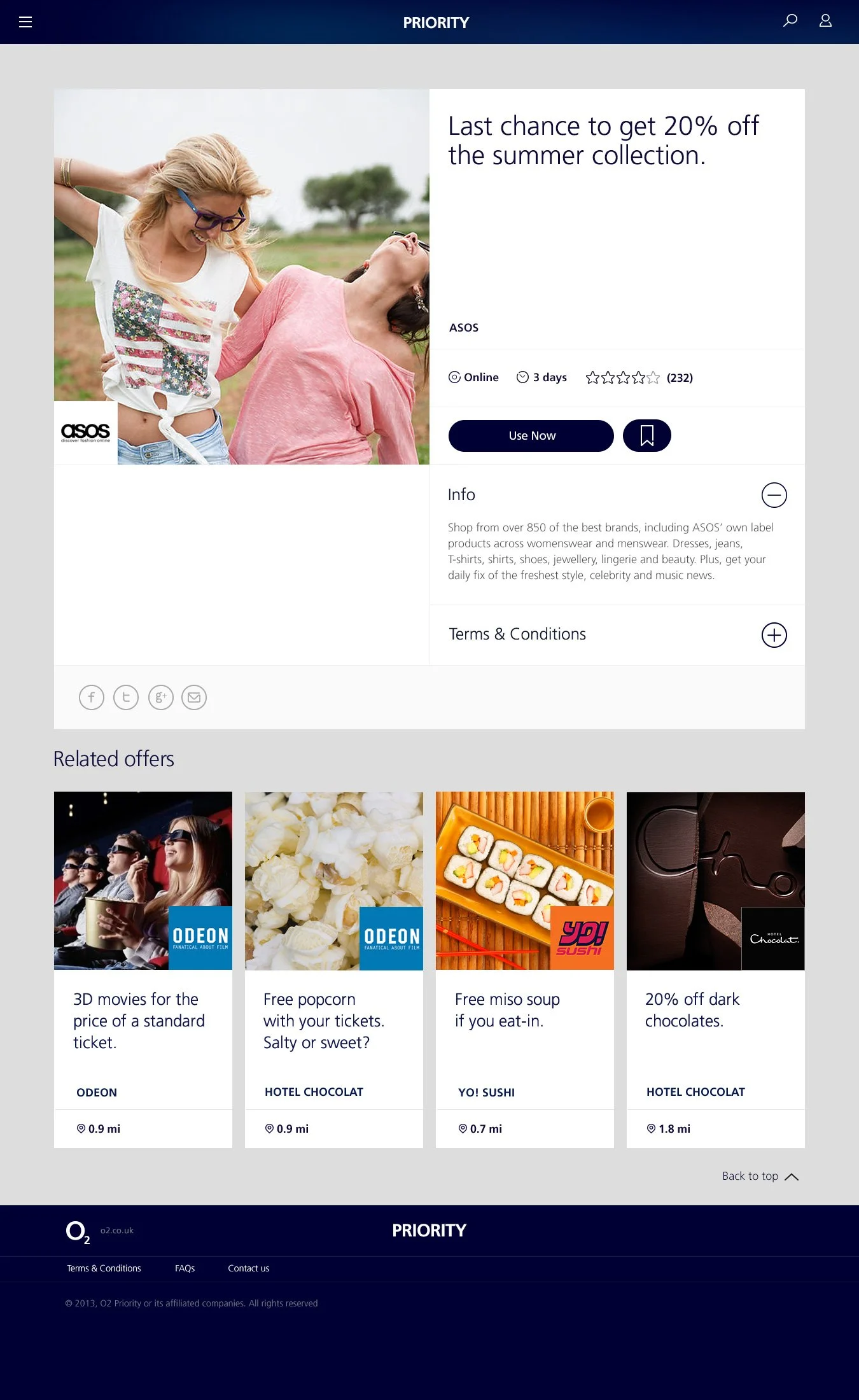
O2 Priority is a digital platform available exclusively to O2 customers. Using the iOS and Android apps or website users can access exclusive offers, tickets, content and experiences. O2 partners with high street as well as luxury brands and big names in entertainment to provide unique value to its customers.
Brands including Odeon, WHSmith, Asos, French Connection, Burberry and Harvey Nichols bring everyday treats and special one-off vouchers and deals. Big music and sport event tickets are available for sale to Priority users ahead of general public release. The app is available on iOS, Android and as a responsive website.
Responsibilities
— Ownership of visual design design system
— Design UI components, styles
— Icon design
— Define system guidelines
— Design and deliver system documentation
— Contribute to UX and interaction design
— Present solutions to stakeholders
The Challenge
Priority was one of the first mobile apps O2 for the iPhone and it was a great hit with O2 customers. Android and responsive web were added later to make Priority available to even larger customer base. As technology and mobile user behaviour evolved, the legacy platform needed a major refresh.
The goal of the redesign project was a comprehensive overhaul of discovery and consumption off content and unification of user experience across iOS and Android native apps and responsive web.
The Solution
Unified Design System
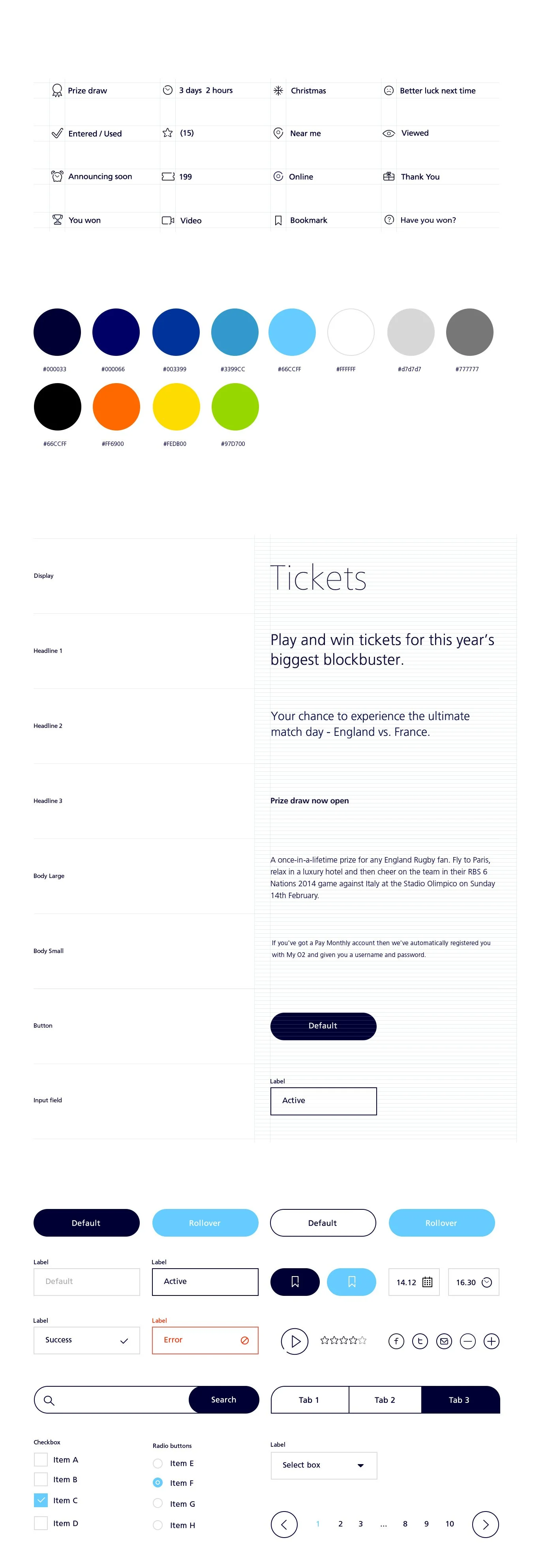
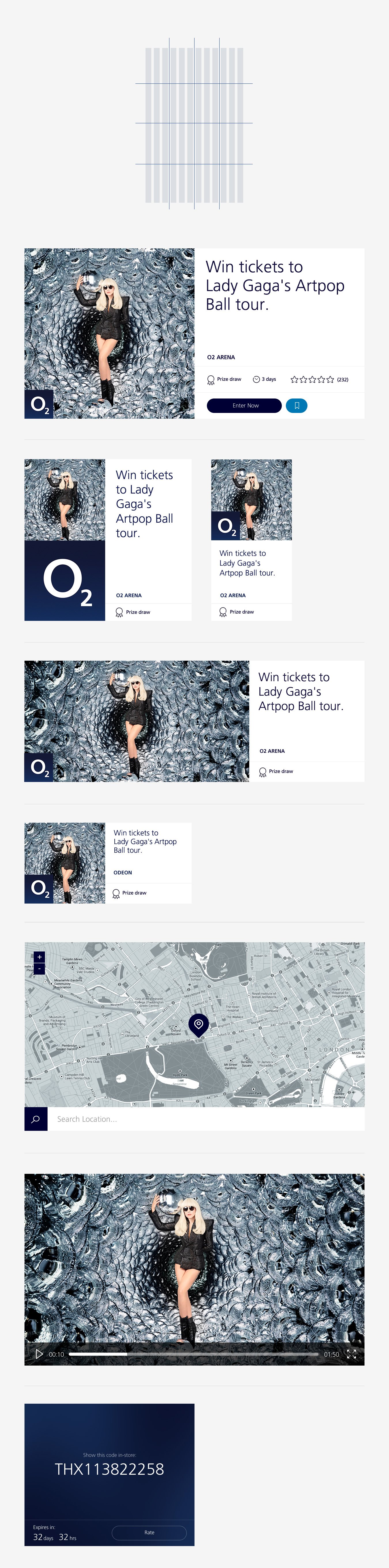
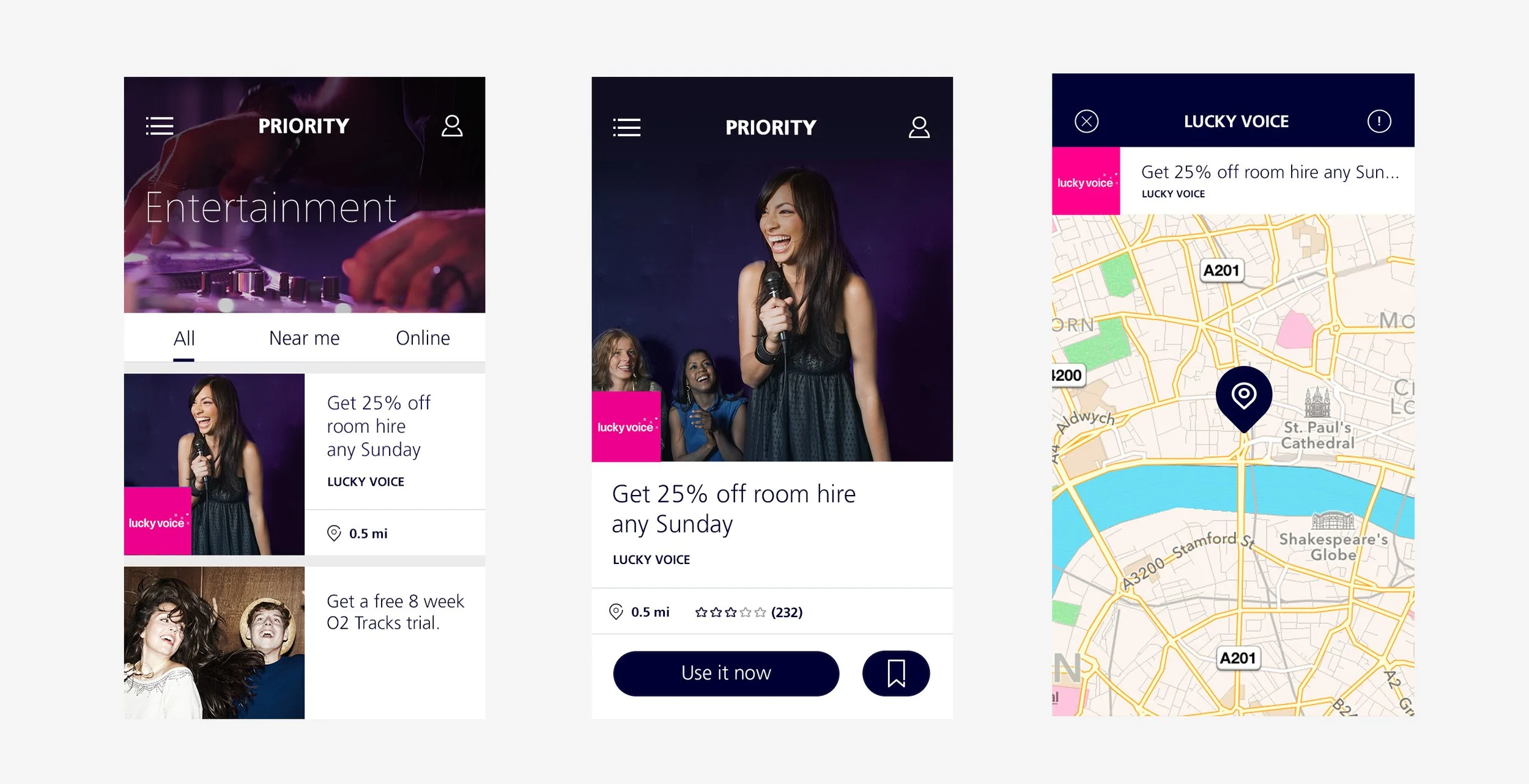
To establish consistency across the Priority platform we designed a unified design system with foundation styles and components easily adoptable for different code builds. At the core of the system is geometric modularity applied not only the layout but also to type, icons and spacing. Using multiples of a baseline unit, the sizes of all elements are harmoniously unified in their proportions and work seamlessly in many combinations.
Optimising user experience
The team consisted of dedicated UX and UI designers. We focused our design work on helping the user get to relevant offers with minimum effort. Another goal was to simplify the way offers are used and redeemed. My role was to support lead UX designer and contribute solutions, wireframe drafts and prototypes which were evaluated, tested and further refined before starting UI design.
Scaling up mobile
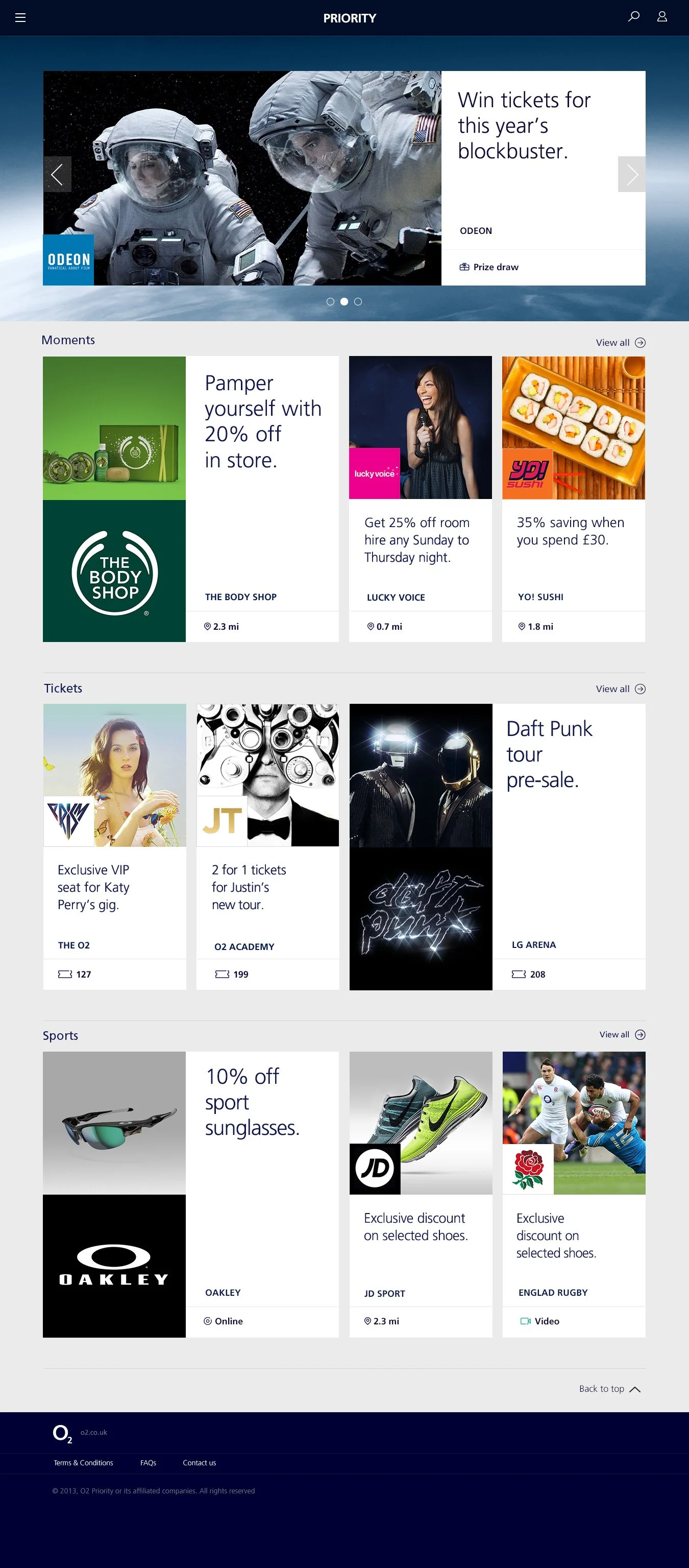
While the native apps provided the best experience for regular users, the responsive website was the showroom for attracting new users. Traffic from promotional emails and SMS could be easily channeled to the exiting daily deals without the barrier of app installation requirement. The modular design developed for native apps was easily ported to the responsive web. Content blocks could be rearranged for optimal experience on any screen.
Smart modular design
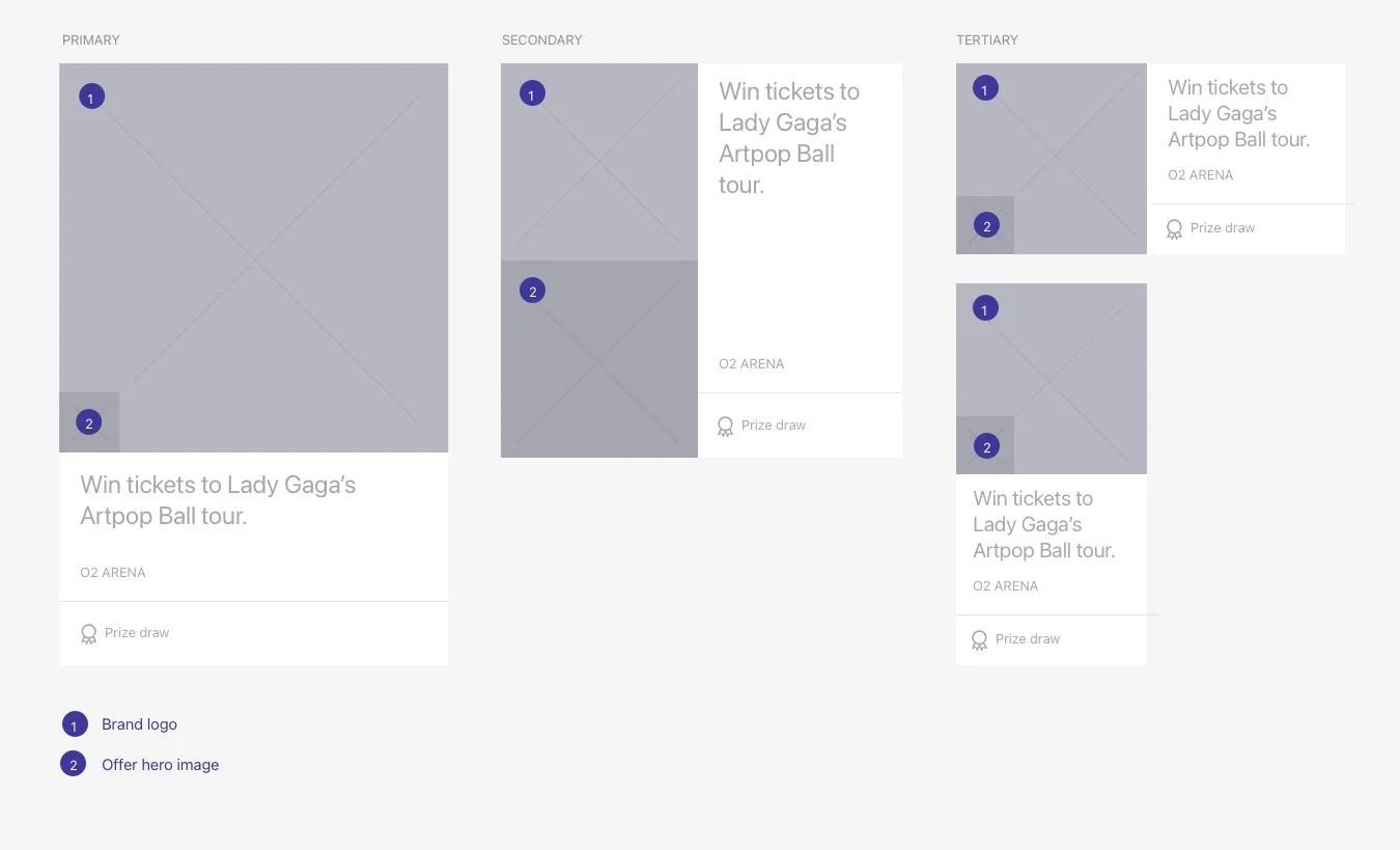
As content lists were being defined and pages being developed, we were in danger of an ever growing and unmanageable array of bespoke layout patterns and image aspect ratios. The solution was to radically simplify layout with modular layout blocks that can be rearranged in number of ways.
Simplified asset creation process freed the editorial team to spend more time making sure the photographs of offers were the best posible. As a result user were rewarded with better representation of offers and hight quality content.
Using images to build a distinctive voice
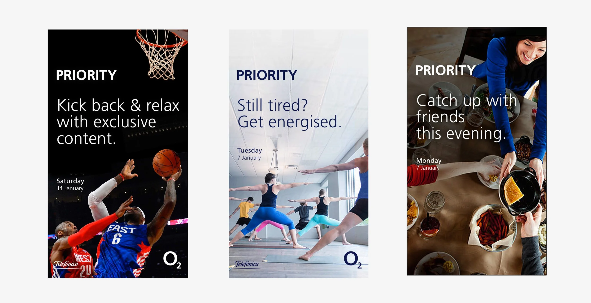
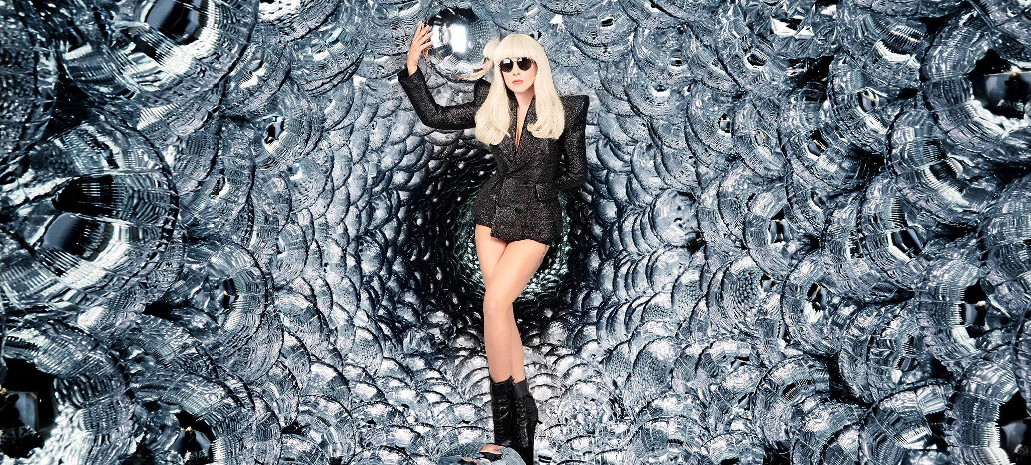
The photography supplied by brand partners is crucial to the Priority experience. Whether it’s a regular discount for a favourite coffee shop or a lady gaga concert, rich imagery gives users a window into each offer. Letting photography lead gives the UI a bold and uncluttered appearance, and makes navigating from offer to offer easy and comfortable.
Results
We delivered a redesigned experience in 3 major phases for each of the Priority platforms. The feedback from the customers and the O2 client was overwhelmingly positive. The apps received improved user rating in the app stores. New users a active users both increased. The design system delivered with the redesign served as a platform for faster product iterations and delivery of new features.